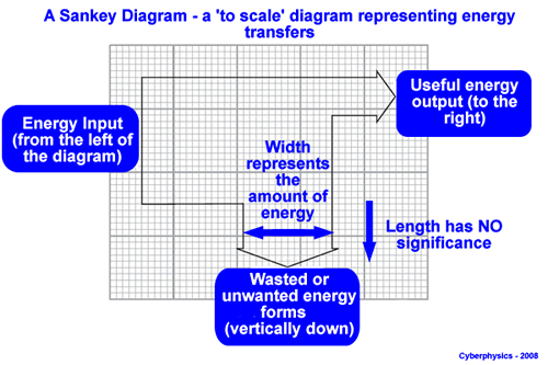
A Sankey diagram gives a visual illustration of an input/output situation. It is drawn to scale - there are lots of variations as to how they are drawn - only thing they have in common is that the width of the 'arms' represents the energy transferred but the length of the 'arms' does not!
Sankey diagrams allow us to visualize flow through a process or system more easily than a table of numerical data can.
They show not only the energy transfers involved but also the quantitative distribution of values in the transfers.
Sankey diagrams do add an 'indisputable expressive power to mathematical rendering of a system'. When constructed properly, Sankey diagrams represent flow in a manner that can be perceived by anyone, instantly.
However, Sankey diagrams can be difficult, time-consuming, and uninteresting to produce by hand - very tedious to draw! The benefits of being able to generate these diagrams automatically, anytime, are obvious to anyone who has tried to draw one and commercial computer packages for their production are available.
They are used not only in physics and engineering to demonstate how energy is distributed but also for cash flow in businesses.
In the AQA GCSE there is a specific way in which the Sankey diagrams is to be drawn.
- The input is from the left of the diagram.
- The wanted (useful) output is to the right.
- All unwanted (wasted) output is made to go vertically down.
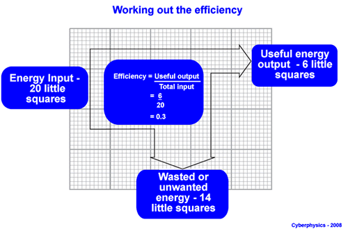
Remember the total input always equals the total output - but an efficient system will have a high percentage of useful output.
|